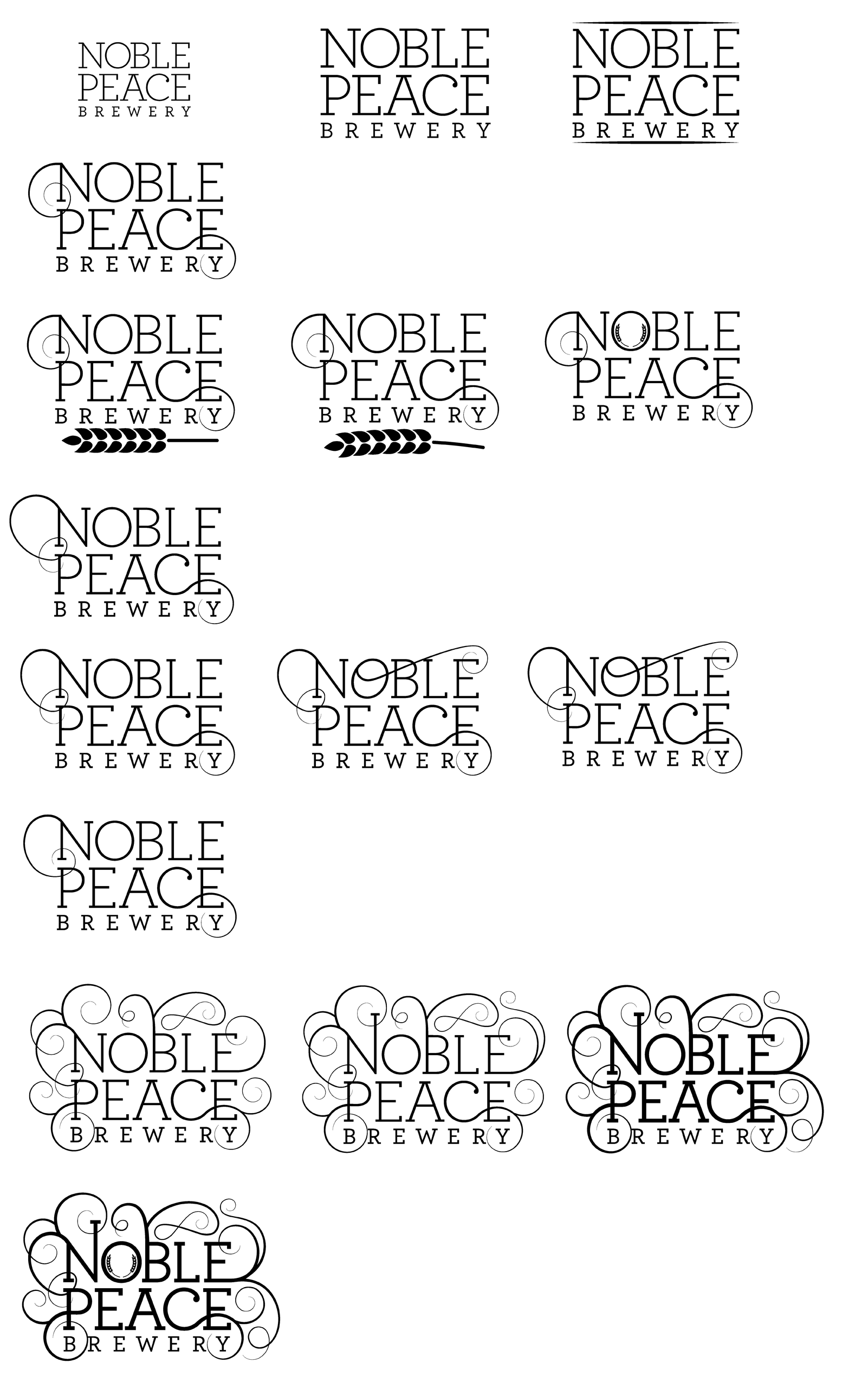
This is the progression of the logo:
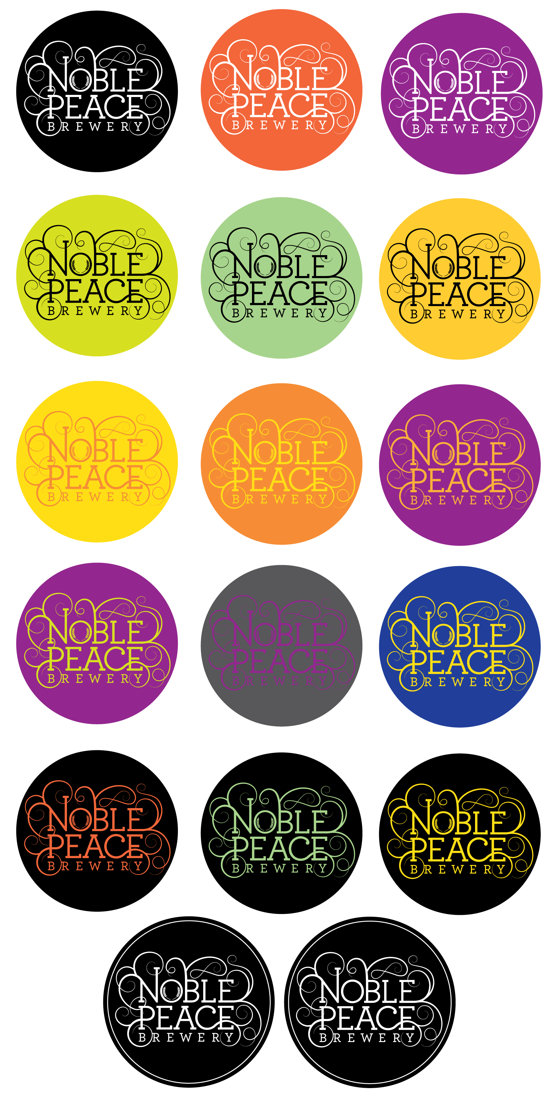
Once deciding on the logo, I played around with different color combinations and containers:
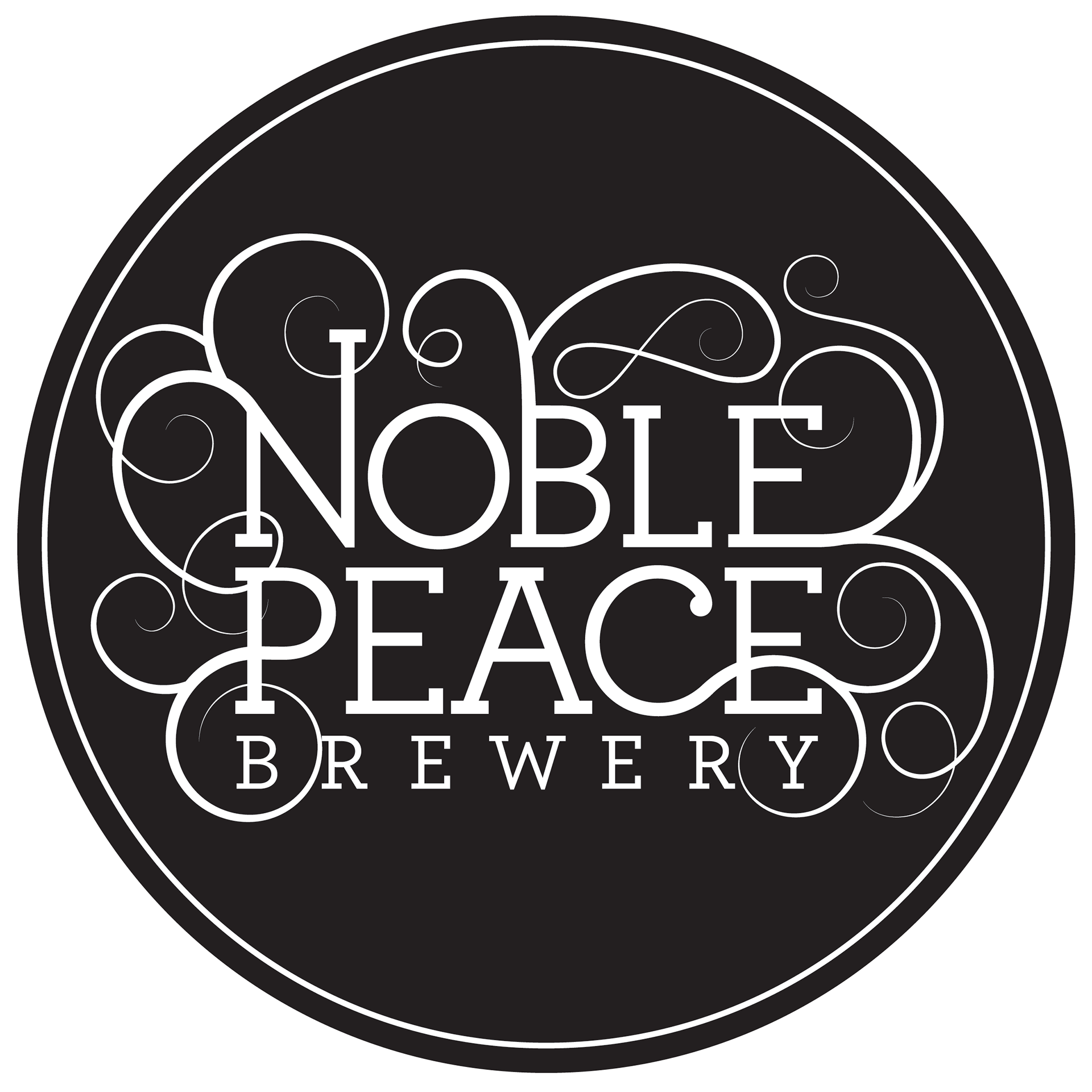
In the end, I decided to stick with a simple black and white color scheme that would be changed depending on the beer label, and I removed the wheat from the "O" because it seemed to get lost in smaller applications: